My Work :: Part 4: Oh, the Angst! AngstyBishy on the Loose
Well, we are finally moving forward on AngstyBishy. I got brave and decided that I have been scrutinizing the design too long, so I have now checked him off and called him done. Phew, how liberating!
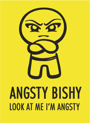
I posted our guy at DeviantArt, so I hope to get comments on him soon. I only have one but it was very nice. =) I wrote a short blurb there (well, short for me) about him, how he came about and how I created him, but I'll expound on that here. To be honest, I still can't believe he turned out as well as he did! Not that I am surprised that I could create something good, since I have some faith in my ever-honing skils, but because I love the style of him so much. I based his overall look on our Ello logo's style, and I am so proud of how both have turned out.
While I love the scribbly art styles of, say, the Danger monsters, the Ugly Dolls, or Bono's Peter and the Wolf Illustrations, I wanted a more controlled and polished look. On the other hand, I love the computerized sleekness of images from Robots and Angels, Peter Hoey, and Ryan McGinnes, but I wanted to have a more humanistic, hand-drawn look. So I'm so happy that I somehow managed to combine the two. I think that taking a Japanese Calligraphy course in college helped a ton, as I learned how the brush naturally flows, and somewhat imitate that when I draw in Photoshop.
On to process: I scribble several versions of the guy onto scraps of paper; I originally wanted him at an angle, hands in pockets and slouchy, but obviously that changed. I did an offhand sketch of him with arms folded, and I knew that was the body language I wanted to use. I scanned in the finalized pose into Photoshop, and used the brushes to redraw the lines in a more calligraphic style—this took as long as the sketching, because I wanted the brushes just right. Originally I had a pulsing vein icon on his head, but removed that as we felt it was an unecessary detail that drew too much attention to itself. Then I took my tiff of the guy with the final brushstrokes, and placed him into Illustrator. I redrew him with the pen tool, tweaking the brush lines until I was satisfied. And that's how the AngstyBishy character was made!
For the font, I didn't spend as much time as I would like choosing one, as I wouldn't allow myself to buy any new ones right now. =) But the Futura font is a pretty good fit, I think. I added a curved stroke to soften the font's edges, to better match the organicness of the guy. Again, I'd love to fuss more with it, but it is good enought for right now so I'm forcing myself to stop messing with it. There comes a point where the changes are more destructive than not, and I can sense myself reaching that point. Maybe in a month or two I will have an epiphany and change something, we'll see.
That's all for now on AngstyBishy. As stated in the Ello Studios blog, I am going to start working on the first character in my fanart series: Sasuke from Naruto. Is he not the perfect choice, since he is angst personified? I finished his final sketches last night, so I hope to have him up soon. I will post him at DeviantArt too, so stay tuned!
posted by Lizzabell @ 12:12 PM
0 comments
![]()


0 Comments:
Post a Comment
<< Home