Monday, February 27, 2006

Manga Tools :: Part 2: Lettering Manga & Finding Fonts

Even though this is a non-issue for me, I am sure for many people out there the very idea of having to create word balloons and/or add good-looking type to their pages is enough to make them cry. Because it is a challenge to be sure. Here are some of the tools I've been using so far that will hopefully make our (and others') manga lettering a success.

:: Our (or rather my, since Elicia has no clue) Lettering Strategy ::

First off, I plan to do all the typing in Illustrator, since it has the best type tools by far. There are so many briliant ways to manipulate type with that program—some of which I might cover later—that I don't know why anyone would even attempt to do the same thing in Photoshop. Manga Studio's type tools might be equally as great, but this is my first choice by far.

I haven't decided yet if I will do the balloons in Photoshop with the Wacom or in Illustrator with the pen tool—both have disctinct advantages after all. With Photoshop I can get a more natural line matching my drawing style, and can always leave it on a separate layer in case I want to change the balloons later (such as to better translate it in diff languages—but I'm getting way ahead of myself with that idea.) But in Illustrator I can manipulate the balloons just as easily—I would just import the artwork and do all the balloons on a layer above that (there are some great tutorials on how to do just this at ComicBookFonts.) Decisions, desicions.

I still haven't located a comic font I like yet. There are some pretty good ones online—ComicBookFonts' site has some nice free ones I've downloaded and might use for our beginning stuff, but I don't know yet if they are a good fit for our more epic stories. I really want to locate the right font before lettering, because otherwise I'll have to go back and redo it all later, and why set up such a frustration? The same goes for fonts that would be used for our manga logos—I'm picky about fonts so this may take a while until I'm satisfied. =) Believe me, if I find one it'll be such a big deal, so you will definitely hear about it when I do.


:: Lettering/Type Resources ::

I think it's important to know the rules of good type first, and then learn how to add the type to the page after you have mastered the type basics.

There are two books I got in school that have helped me the most in learning the rules of good type, both as a beginner and now as a paid designer. (I refuse to say I'm an "expert," as I am certaintly not that quite yet.) They are The Mac is Not a Typewriter by Robin Williams (no, not the comic) and Stop Stealing Sheep and Find Out How Type Works. by Spiekermann and Ginger.

The first is a simple reference to the rules of type and also works as a hande desk reference for typing special characters and such. Apparently there is now a second volume of this out, which I probably must buy, as well as a version for PC people. The second is a slim textbook that is an easy yet informative read. Both are very slim yet pack a ridiculous amount of information.

Adding the type to the page doesn't have to be stressful either. ComicBookFonts has a good glossary of lettering terms and things to watch out for, as well as good reference guides and tutorials on the subject (creating balloons, combining two balloons together, etc.)


:: Font Resources ::

It's always useful to know where to look for good fonts. There are so many places to look, but I will list my fave ones. And sorry moochers, but you have to pay for almost all the fonts at these sites. =) When it comes to fonts you usually get what you pay for; any decent designer can spot a free internet font, since the quality is almost always sub par. But good fonts are worth every penny, I promise you.

When I need a font for a design project, such as a logo or headline font, I always go to MyFonts first. They have a large selection and let you test-drive the fonts first with your own text, and have other nifty features. I've bought a bunch of fonts from them and it is super easy. Plus, if I ever make my own fonts I can sell them at MyFonts if I want. Sweet!

I've been talking about this site way too much lately, but ComicBookFonts is another good place to buy fonts, especially for doing comics or manga. And apparently J.J. Abrams loves them (I think he bought the Alias font from them), so there's a big incentive to check them out right there. =)

I accidentally stumbled acrossWalden Fonts' site when searching for an obscure font style, and they are now one of my fave places! They specialize in high quality historic fonts, and as far as I am concerned nobody can touch them.

House Industries is probably my fave font house of all time. Their fonts all have this fresh, modern feeling but their style is pure retro. Pricey but worth it. I have four of their fonts because they were included for free in a special book that HI put out; I haven't used them much yet but if I ever need to, I will be super excited. =) As a bonus, I got to meet some of their type desingers at a design conference; just a bunch of really nice, laid back, super-talented guys who work there. I was starry-eyed but managed to talk to them and have an informative and coherent conversation. =) I usually embarass myself but managed not to that time; yay for me! I also love their site; it is hard to make a commercial site look good sometimes, especially font sites, but they have done a good job.

This site is one of my newer loves. 2Rebels is a canadian company and their work is really great, some of it quite cutting-edge. I love their site, though it can be confusing to navigate at times.

I loved the original site for Margo Chase, but I guess she's taken it down since she created the Chase Design Group; you can peruse some of her works at their site. She is the talented lady who designed the logo for Buffy the Vampire Slayer, among others, and is a master of what I would call haute gothic. Her original site featured a bunch of her fonts for sale, some of which you can now buy at MyFonts if you so desire.

There are also great font books that list hundreds of fonts and where to buy them. I'll list those on a later date.

Megatokyo Announcement!

Wow, I feel like a reporter being handed a breaking news announcement! (Except for the fact this was announced yesterday; oh well.) Elicia called me up at work and told me to go to Megatokyo's site right then and check Piro's blog. I did and found the huge bombshell that was announced yesterday at the Comic-Con:

DC Comics has acquired the rights to print Megatokyo!

From what I can tell, Fred still owns his characters and all that stuff, but DC will get money from the publishing of his work. A very good deal, considering this isn't usually the way American comic publishers like DC or Marvel operate with their own creators. Kudos to Fred and Megatokyo!

I've posted his site's announcement below:


:: Megatokyo joins CMX ::

Sunday - February 26, 2006
[Piro] - 19:12:00

Recently i've alluded to the fact that i've been busy with some things i couldn't yet talk about. Now that the official announcement has been made at New York Comic Con, i can:
"DC Comic's Manga imprint CMX Acquires publishing rights to Fred Gallagher's Acclaimed Megatokyo Series"

Starting with Volume 4, Megatokyo will be moving to DC comic's manga imprint CMX. In fact, i'm already working on Volume 4, which is slated for release in June.

I'm very excited about joining the CMX family as the first Original English Language manga in the lineup. In talking with the DC / CMX folks, I got a strong sense of commonality between what I wanted to do and where they wanted to go with manga. I feel they have an excellent understanding of what it takes to create the kind of work I want to produce and know that they are going to be very supportive of my efforts.

Megatokyo volume 4 will contain Chapter 5 and 6, of which Chapter 6 is some of my best work to date. The primary extra material in this book will be a revised and expanded version of the short story "Circuity" - the online version of which i feel is way to compressed. At 224 pages, this will be the thickest Megatokyo volume to date.

I did a few quick interviews over the weekend, and the one at the Pulse is already up. It should answer many of your questions. :)

I'm very excited about this opportunity to work with DC / CMX, and i'm looking forward to finally releasing what i believe will be the best Megatokyo volume to date.

Wednesday, February 22, 2006

Drawing Manga :: Part 2: The Job of an Inker

I just wanted to post this really quick. =) I found this site today which shows comic pages before and after they were inked, by some of the greatest American comic artists. A truly eye opening find, and I hope a great example of how an inker's job is not just to trace all the hard work done by the penciler.

I gave in and a few weeks ago bought the DC inking book from that series I like; this too explores the often misunderstood relationship between inker and penciler. In the book the author is emphatic about the symbiotic relationship between the penciler and inker, and how these two great artists have an equally important role to play in telling the story. Very very true.

While Japanese manga uses slightly different tools to tell their stories—tone patterns and "simpler" pen lines in comparison to the American use of color and dramatic inking techniques—the inking skills of the Japanese are no less superior. A great Japanese example of this is Kishimoto. Some of the greatest pages from Naruto are almost entirely devoid of tone; instead he uses the pen to skillfully represent weight, light, and texture and it is absolutely stunning. A true master at work. (An online example of this can be found here at Shonen Jump's site.)

::

And yes, the olympics were exciting last night. The Americans did so good in the two-women bobsled! I loved the story behind Shauna Rohbock and am so glad she finally got to compete in the olympics. And I didn't begrudge the German team winning at all, as apparently the team's driver is one of the greats and it is her last olympics.

Speed skating was exiting, and just as dramatic as ever; will Shani Davis and Chad Hedrick ever stop fighting? Congrats to the Italian underdog though; he will forever now be an Italian superstar. =) I hope he's up for it.

And women's figure skating was as interesting as I hoped it would be. I'm glad they got rid of the rules that women can't wear pants and that a lot of the women didn't just wear white skates, because I think it makes for a more artistic presentation. And did anyone else love it when the Japanese skater bowed to her coach? That was one of my fave non-competitive moments of the night. The finals are shaping up to be very exciting.

Manga Artists :: Part 5: American Artist Frank Miller


I love that Whitney is such a comic book geek, because through her I have learned a lot about the American comic book/graphic novel scene. On her blog to day she posted a great interview with American comic legend Frank Miller, which I really really liked and am therefore posting in its entirety below, so that I will forever have a copy of it. I can't wait for part 2 to come out. My fave line from it is this:

"The Greeks had their gods and heroes; we need to have ours."

So true. Are comic book heroes just a modern version of our folk heroes of old, a way for us to celebrate goodness and justice in an world that seems to mock those virtues? Who knows, and it's way too early in the day for me to write truly deep thoughts on the subject. So just read the article and enjoy.

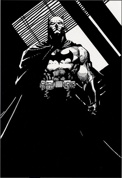
:: Wonder Con 2006: Frank MIller Spotlight, Part 1 ::

At this year’s Wonder Con, Frank Miller has his own spotlight panel, wherein he was interviewed by Charles Brownstein, the Executive Director of the Comic Book Legal Defense Fund.

You may have heard about it.

Something about Miller’s upcoming Batman book being about the hero fighting terrorists…or something.

We now present part one of a full transcript of the discussion between Miller and Brownstein.

Charles Brownstein: Frank, one of the consistent themes and consistent elements in your work is the urban environment, and it’s shifted a lot in time. When you began, there was a real sense of urban realism in regards to Daredevil, Batman: Year One, and Dark Knight. It transitioned into surrealism with Hard Boiled and Elektra Assassin, and there seems to be a stark, minimalist blend of the two in Sin City. So how did a farmboy from Vermont establish an interest, and more importantly, a facility for depicting these environments?

Frank Miller: I think precisely because I was a farmboy from Vermont I was able to fall in love with the city from afar. I think it helped me see its romance. I didn’t grow up in it, so every corner I turned when I was first in New York was a brand new, magical thing.

My view changed as my approach to the craft changed, but also as I moved from city to city. That’s why there’s so much Los Angeles in Sin City, because I was living there at the time when I created it. That’s why it’s full of palm trees and tiles and all of that. It also helped contribute to the fact that all the girls were gorgeous and the cars were vintage – because things don’t rust out there.

CB: When and how did the enthusiasm and imagination for the urban settings become subsumed by the observations and experiences of living in cities?

FM: I guess I learned, the more time passed, that cities are made of the people that fill them. I love buildings, but they’re all stories about people. The whole artifact is man-made, and every building is an artifact, so these buildings that shoot to the sky are extensions of us.

CB: One of the interesting things, reflecting on your body of work, is that Daredevil is, I think, without parallel, the most romantic thing you’ve done. A critic once observed that “the carefully crafted cityscapes made the book a love letter to New York” which I think is absolutely true. There was also the tortured, youthful romance of Matt Murdock and Elektra, which is a really good metaphor for something that everyone has to suffer through…

FM: Or at least you better suffer through it, or you’re missing something.

CB: That’s right. And then, there was above that, the bond of brotherly affection between Matt and Foggy, and the occasional intrusion of longing for an absent father. Without asking you to divulge too much autobiography, what aspects of your own experience informed these themes?

FM: Well, the love letter to New York part was that I was in love with New York. I hung out on Hell’s Kitchen rooftops with my sketchbook all the time. The city’s changed a lot since then, but it’s kept its essential magic. Now I’m back in Hell’s Kitchen, where I belong. As far as the other things, the youthful romance gone bad, the sense of brotherhood and all – we all go through them. They’re very eternal, and all but universal.

CB: What insights into the human condition did you gain, and more importantly, hopefully convey in that work?

FM: I don’t know about anything from the work, I was mainly gaining it from the world, and translating it into the work. I went from rural Vermont, to New York City, to Los Angeles, and back. The thing that most struck me was that, in New York in particular, people are right out in the open. One of the reasons it’s such a successful melting pot is that people are face to face. People tend to walk, or ride on trains, rather than drive everywhere. L.A.’s a city where individuals are much more isolated in their wheeled fortresses, and there’s less face to face connection. So no wonder they end up having race riots, because people can avoid each other so successfully.

I guess what I saw was every kind of human interaction I could ever imagine, plus more.

CB: Daredevil really bears the hallmarks of a young man’s work. It’s filled with the ambition, hopefulness, energy, arrogance, and swagger that we all have in our 20’s. We all think that we own the world. Matt owned New York – he was leaping from rooftop to rooftop, he’s kicking ass and taking names, he has all of that. Looking back on that work with the hindsight of age, what aspects do you feel hold up best and what enduring ideas and themes are contained within it?

FM: It’s always hard to review one’s own work, but the things that I cherish most about the Daredevil run are the celebration of New York City, which I think deserves a celebration. I remain madly in love with it. The other thing that I would pinpoint, beyond the constant and steady heroism, is the romantic aspects. If you look at Sin City, you’ll see that clearly, each one is a love story. I’m going to challenge one thing you said when you said that Daredevil was my most romantic work. I think the most romantic thing that I ever did was That Yellow Bastard.

[audience laughs, applauds]

CB: I’ll take that, Miller – why?

FM: Because it’s a story of pure love and sacrifice. It’s star crossed lovers…generationally crossed lovers, and Hartigan’s love for Nancy is so pure that he not only will not consummate it, out of a sense of propriety, but he will sacrifice everything he has – not only his life, but also his dignity and his reputation.

CB: Going back just very briefly to Daredevil - when you started the book, you were a hayseed. How did you change in that process, in the discipline of a monthly work, and in the creative leaps and bounds that you made?

FM: The ‘80s were an electric time to work at Marvel Comics. Jim Shooter had turned the company around in a very dramatic way. Now, he broke an awful lot of eggs to make his omelet, but he enforced a much more rigorous sense of storytelling. He was always up for a challenge, and was always up for an argument, and he would listen, but mainly, he infused that company with a kind of energy that I don’t think had been in comics – anywhere – for years. Also, in the trenches, month by month, they had to produce a monthly comic. Back then, they didn’t delay a book if you were late, they replaced you. So your job was to produce. That taught me a lot. It taught me that comic books happen in time, not as precious little pieces of art. That it’s the story that counts more than anything else. So the art by its nature can be very direct. So, it formed me in a lot of ways. I couldn’t have done Sin City without having put in years of monthly comics.

CB: This is interesting to hear, because you’re talking about the monthly grind, that comics aren’t precious pieces of art. That’s certainly changed. We’re witnessing it – not to bust your chops – with All Star Batman and Robin, which is on a six week schedule. What have we lost in waiting for the work, and making it a precious object, and what have we gained by waiting for the work and treating it as the precious object?

FM: We gained a higher standard of artwork, and we gained better writing too. These are definitely pluses. I find Jim’s work very vigorous – he’s has a very different intellect than mine, and a very different approach. It’s definitely is in the pulp tradition, it’s just that he can get a lot more lines on the page than I can.

CB: Switching gears slightly, in past interviews and conversations with you, I’ve noted that the connective tissue between the two Dark Knight books, as I see it, is that they’re both commentaries on the media environment as it reflects the culture and politics of each book’s respective time. Why did you regard comics as the proper medium and Batman the proper vehicle for composing such commentaries?

FM: I’m going to answer this backwards. Batman was the choice because I’ll always love the character. But also, I find it wonderful to use such a big megaphone to do political satire. As far as the role of political satire and parody in comics, it seemed to me that we were just missing a big bed. Every time I opened a newspaper, unless it was the New York Times, you see an editorial cartoon, and could see how comics could play against current moments and current issues. I felt that we should be in the middle of that game with all the rest. Everybody else talks politics, why can’t we?

CB: Dark Knight Returns acknowledges the advent of media saturation. There are the ubiquitous talking heads moving around the narrative, and they display these…sometimes subtly, sometimes abjectly distorted descriptions of events. What was your attitude towards the media’s overall role in society when you were composing the book?

FM: I composed Dark Knight Returns when Ronald Reagan was president, and very silly things seemed to be happening, and I wanted to satirize them, but they just kept topping me.

[audience laughs]

So I played the media as a Greek chorus, but as a Greek chorus, I don’t know…on drugs or something. They were constantly…jumping ahead a bit…Monica Lewinsky? We have people out to slaughter us, and we’re talking about Monica Lewinsky? So, I wanted to play the media very sarcastically and to show how, particularly television, only hits the surface of the issue, and only gives you issues focused on an hourly, or daily basis, not the in-depth understanding that events should have – especially in a historical context.

CB: How did the enormous swell of media attention you received confirm or contradict your attitudes about the media that you’re talking about?

FM: In just felt like good luck. In terms of the comic book industry, everybody’s waiting for a breakout Batman book. He’s always listed as a favorite character, even when his book’s sales are in the toilet. As for the overall media attention, maybe it was time for comics to break out. We’d been hiding in the shadows too long. Now we’re out there and about, and they’re looking at us, and ripping us off, and some of us are finding work in other fields. We’re finally out there. Dark Knight was a part of that – a big part.

CB: But going into your own work and your own themes and your own territory, you became with Dark Knight, not just the focus of many a fan magazine and CBG article, but you were in Rolling Stone, and were all over the damn place. In the intervening years between the two Dark Knights, you dealt with a lot of media; you dealt with a lot of reporters from the great to the terrible. How did your interaction as an interviewed figure, a media figure, inform your work, and inform the views that went into the work?

FM: … I love it when you ask one of these easy ones…

[audience laughs]

Everything is material, and I learned a lot from being interviewed. Sometimes the interviews can be brilliant, or they can be terrible. The terrible ones are the ones where the writer has already sold the piece with a narrative to the publisher, which was about 80% of the interviews I did. That means they’re asking questions, but they use the pieces of the answers that fit their narrative. The best interviews are the ones that are coming to explore, and there are lots of surprises along the way. Those end up being a portrait…a set of ideas, rather than a Zap! Pow! comics story.

CB: I think Dark Knight Strikes Again was a tremendous departure from Dark Knight Returns…

FM: Damn straight.

[audience laughs]

CB: In many ways, it functions as the polar opposite of Dark Knight Returns. The first book is a really earnest depiction of a world gone wrong, a world really sinister and bleak, and of course it was because there was the Iron Curtain, the Cold War, the nuclear paranoia. We were building up the military industrial complex, and crime was on the rise, and it really commented on that environment. Dark Knight 2, on the other hand, was a brighter sensibility, both in visual technique and in story. It was a vicious satire, where the first was a subtle satire. What was the decision to pursue this opposite approach?

FM: First off, I had to take a different approach, because so many people had been using my last approach.

[audience laughs]

But also, I felt that in the midst of all of this sturm und drang, we’d lost some of the central joy of the heroes. I wanted to get right back to the bone and break it all down, and show you that the Flash was cool because he’s really quick, and I don’t give a damn about his marriage. The Atom’s cool because he gets really little. The way I chose to make that cooler was instead of showing him getting smaller; I showed everything else around him getting bigger. But again, I don’t care about the Atom’s love life. One after the other, I was looking at the characters and getting back to what made them so cool at their core.

At the same time, the [media] culture just kept parodying itself, especially in the internet age, the whole media presence is very different, very much more fragmented. So to have a cultural event about people running around in tights struck me as just our kind of news.

CB: One of the interesting things about technique was the way that you depicted the idea of online news. Paul Pope, I remember, once described it as panel surfing.

FM: [laughs]

CB: What informed the technique that you applied there? The first one was a really rigid grid, but the second was really open, like a Neal Adams story.

FM: The first one was based on cable TV – very sequential. Talking heads that go on for a long time. And though it would cut from story to story, it stayed in a linear fashion. I was trying to capture what I see as an emerging combination of all media, to the point where we won’t really have televisions, or computers – we’ll have these systems whereby you can witness five different stories at once. In that model, the presentation becomes briefer and briefer to the point of near non-existence, just to keep your attention.

CB: I remember interviewing you on that bizarre CBLDF cruise that we had years ago, and it was about Dark Knight 2. The announcement of the project was made, I believe, at that Wonder Con, or somewhere nearabouts. One of the comments you made was that when you did the book, you were going to capture a kinder, gentler fascism. And this was in the Clinton era. Tell me about the Clinton era and the Clinton environment that led you to use that very poignant phrase.

FM: I’ve found that these days, everything is expressed as its reverse. And so, the very word “freedom,” one of our most important words, has switched from the freedom to do something to freedom from something. In other words, “freedom” means something you can’t do. Through all the various grievance groups, we’ve set up a very restrictive society where people are afraid to think things, let alone talk them if they stray from a kind of understood dictate.

CB: Talk to me about Monica Lewinsky and the talking heads, and how your obvious outrage at these things informed the landscape of this book.

FM: I stumbled into 9-11, because…well, I didn’t even know who was going to be the next President when I started DK2. And there did seem to be an essential silliness to the news. There were great issues shaping the world, and everything was and is, Paris Hilton, Monica Lewinsky, and all this nonsense. And then, along the way, I happened to have this Brainiac monster destroy Metropolis. And then they took the Towers down. And killed 3,000 of my neighbors. All of a sudden, I realized I’d walked into a maelstrom. The people at DC Comics, through Bob Schreck, told me that I could go whatever way I wanted – I could remove things, redo that, it was fine. But I told them I’d rather write through it. And so, that’s why there’s an abrupt shift in tone in the middle of the book, because that’s when 9-11 happened. The book, and my life, and our country changed forever.

CB: Let’s drive through that. Let’s drive through how the book and your immediate reaction to 9-11 was formed in the context of the third issue. What were you thinking, and what were you working out on the page? What do you think you conveyed?

FM: What I was describing was absolute shock. There was no way to address the issue of the actual enemy. I mean, after all, Dark Knight is always parable, but I had to get across what it felt like to live in New York, in the aftermath, when you were chocking on dust for weeks, when you didn’t know what you were coughing up, or who. It was a terrible time, and I wanted to get that across. I knew you always had to personalize things, as well, so I killed Lois Lane.

CB: That was a heartbreaking page. There were two moments that really captured 9-11, in my view, in that book, and one was the photograph of Lois Lane in the wreckage, and the other was that marvelous two-page spread where one page is ash, and the other page is bright blue sky. It came across very well. Certainly, politics have really informed the direction of your cartooning – you’ve always been very political. My understanding is that your next major graphic novel is probably going to be the most overtly political of your works.

FM: Yeah.

CB: Tell me about it.

FM: My next graphic novel, I’ve inked about 120 pages of it, so it’s a work in progress, and will probably be about 200 pages long – is called “Holy Terror, Batman!”

[audience applauds]

FM: And not to put too fine a point on it, it is a piece of propaganda. Batman kicks al-Qaeda’s ass.

[audience applauds]

CB: Alright – so in calling it propaganda, how do you want your art to impact the war effort?

FM: I want us to win the war…

[very minor applause]

FM: Oh, only a couple? I know this is San Francisco, but come on! What, you want to lose?

I’m doing this mainly as an explosion from my own gut in reaction to what’s happening now, but also as a reminder to people who’ve seem to have forgotten that we’re up against an utterly ruthless existential foe who is as vile as any we’ve ever faced. I’m appalled at the equivocations, and I wish that the entertainers of our time had the spine and the focus that the ones who faced down Hitler did.

[From audience: “Amen!”, applause]

CB: Taking the opposite tact, however, why do you think it’s proper, and what impact do you hope to achieve using one of the most recognized pop-culture icons of the West as a piece of propaganda?

FM: Superman punched out Hitler. So did Captain America. That’s one of the things they’re there for. These are symbols of our people, of our country. These are our folk heroes. It just seemed to be kind of silly to be chasing around the Riddler when you’ve got al-Qaeda out there.

[applause]

CB: What can you impart to us about what we should expect from this story?

FM: Be afraid.

I don’t want to go too much into it, but it’s very pulpy. It’s quite emotional, and I think it’s the best artwork I’ve ever done.

CB: I’ll second that – I’ve seen some, and it’s great.

FM: Again, it’s a love letter to a city, because it’s about Gotham City coming under attack. So it involves a lot more dramatic, industrial landscapes than I’ve done in years. Emotionally, it’s deliberately raw. Whether it comes between a man and a woman, or a man and his city, or between a man and a guy who’s going to go out and kick al-Qaeda’s butt.

CB: You just described these characters as our folk heroes, and it’s absolutely true when you look at the World War II comics, they did use the characters to improve our national morale, to show Captain America punching a really stupid looking Hitler on the nose. That’s really not something that we’re seeing in the media, and here you are staking your claim that you’re going to take it back. So culturally, as readers, how do you think that the use of these heroes to convey these sorts of messages helps us work through the crises that we’re facing?

FM: I don’t now what the effect is, I just know that these are really good tools. The Greeks had their gods and heroes. We need to have ours. During the darkest part of the urban crime wave, up comes Dirty Harry and becomes an instant folk hero. Superman’s always stood as a real icon, but an icon of what? It’s worth a look. Is he this complicated character with eighteen relatives from Krypton living with him, who’s got some complex personal life? Is he the flag-bearer that he came to be during World War II? Is he the golem that he was in the late ‘30s and early ‘40s that dragged generals to the fronts to face each other, to face the bullets the soldiers were facing? Is he the confused guy from the ‘60s? Is he the kind of bland guy from the ‘70s? So who is Superman? Since they’ve made him more powerful than God, I figure he had all the bad guys stopped. It was a matter of converting him.

Batman, the same way, is a man who’s in love with a city. He’s not protecting a planet. It made sense that he would be protecting Gotham. So what are they there for? Are they really going to be up against Toyman in the next issue? Are they really going to be saving damn cats from damn trees? They’ve got to do something with all of these powers.

Check back tomorrow for the conclusion of the panel, beginning with a discussion of All Star Batman and Robin the Boy Wonder, where Miller is presented with the question from Brownstein of, “Why is Batman a dick?”

Newsarama Note: The transcript of this panel was proofread by Brownstein. Any mistakes or misquotes belong to Brownstein, rather than Miller or Newsarama.

Tuesday, February 21, 2006

Silver Posts and Lazy Sundays

I have reached my silver post (post #25) already! How exciting is that? Twenty-five of my little thoughts rambling around somewhere in cyberspace. I don't know if I should be proud or embarrased. If there are any lurkers out there (and you know who you are,) could you post a little teeny comment in honor of the occasion? Just so I know if anyone out there enjoys reading this blog as much as I do writing it.

(Though even if I got 100 comments about how much it sucks, I still would keep writing it, so maybe not commenting is for the best. If someone truly hates my blog, my continuing to write in spite of their hatred would only lead to more and more frustration for them. Though if they hate it that much, why keep reading it? Life is too short to read stuff that either you don't like or won't be helpful to you in the future. Aaaaaand I'm rambling, sorry.)

I just wanted to take the time to post a shout-out to one of my fave modern SNL skits, which has now been taken off of YouTube for legal reasons. >(

The article below talks about the phenomena of "Lazy Sunday." I've italicized the part of the article that interested me the most, about their creative process and how doing shorts like these propelled them into a career on SNL. Very cool.


:: Nerds in the Hood, Stars on the Web ::

By DAVE ITZKOFF
Published: December 27, 2005
The New York Times

Video: 'Lazy Sunday' (nbc.com or iTunes)
Forum: Television
thelonelyisland.com
Andy Samberg, left, a featured performer on "Saturday Night Live," with his friends Jorma Taccone and Akiva Schaffer, writers on the show.

For most aspiring rappers, the fastest route to having material circulated around the World Wide Web is to produce a work that is radical, cutting-edge and, in a word, cool. But now a pair of "Saturday Night Live" performers turned unexpected hip-hop icons are discovering that Internet stardom may be more easily achieved by being as nerdy as possible.

In "Lazy Sunday," a music video that had its debut on the Dec. 17 broadcast of "SNL," two cast members, Chris Parnell and Andy Samberg, adopt the brash personas of head-bopping, hand-waving rappers. But as they make their way around Manhattan's West Village, they rhyme with conviction about subjects that are anything but hard-core: they boast about eating cupcakes from the Magnolia Bakery, searching for travel directions on MapQuest and achieving their ultimate goal of attending a matinee of the fantasy movie "The Chronicles of Narnia: The Lion, the Witch and the Wardrobe."

It is their obliviousness to their total lack of menace—or maybe the ostentatious way they pay for convenience-store candy with $10 bills—that makes the video so funny, but it is the Internet that has made it a hit. Since it was originally broadcast on NBC, "Lazy Sunday" has been downloaded more than 1.2 million times from the video-sharing Web site YouTube.com; it has cracked the upper echelons of the video charts at NBC.com and the iTunes Music Store; and it has even inspired a line of T-shirts, available at Teetastic.com.

"I've been recognized more times since the Saturday it aired than since I started on the show," said Mr. Samberg, 27, a featured player in his first season on "SNL." "It definitely felt like something changed overnight."

But Mr. Samberg is already well aware of the Internet's power to transform relative unknowns into superstars. In 2000, when he and his childhood friends Akiva Schaffer and Jorma Taccone, both 28, who wrote "Lazy Sunday" with Mr. Samberg and Mr. Parnell, were still struggling comedy writers living together in Los Angeles, they created a Web site, the Lonely Island, to house their self-produced skits and video experiments.

"Honestly, almost every single one of the films was done at like 4 in the morning, kind of drunk," Mr. Taccone said. But the short movies they posted on thelonelyisland.com—everything from cartoons assembled from clips of old Nintendo video games to satirical rap videos performed in the styles of their favorite hip-hop artists—also gave the three a place to develop their comic voices without the pressure of having to deliver professionally polished work.

"The Internet allowed us to show people much faster, in a way that you don't embarrass yourself," Mr. Taccone said. "You don't have to hand someone a VHS. It's just on their computer."

These videos also provided the Lonely Island team with careers: through their Internet work, they landed an agent, pilot deals with Comedy Central and Fox, and writing jobs for the MTV Movie Awards. In 2005, they joined "SNL," Mr. Samberg as a performer and Mr. Taccone and Mr. Schaffer as writers.


At "SNL" they found a kind of kindred spirit in Mr. Parnell, who has used the program's "Weekend Update" segment to deliver highly inappropriate rap tributes to some of the show's comelier female guest hosts. "I don't think I ever heard from Britney Spears," said Mr. Parnell, 38, who has been with the show since 1998. "But Kirsten Dunst and Jennifer Garner seemed to really enjoy it, and thankfully not be creeped out by it."

On the evening of Dec. 12, the four wrote a song about "two guys rapping about very lame, sensitive stuff," as Mr. Samberg described it. They recorded it the following night in the office Mr. Samberg shares with Mr. Schaffer and Mr. Taccone at "SNL," using a laptop computer that Mr. Taccone bought on Craigslist.

Then, while their colleagues were rehearsing and rewriting that Saturday's show, the group spent the morning of Dec. 15 shooting their video with a borrowed camera, using the Upright Citizens Brigade Theater in Chelsea to stand in for a multiplex cinema and Mr. Taccone's girlfriend's sister to play a convenience-store clerk. Mr. Schaffer spent the next night—and morning—editing the video and working with technicians to bring it up to broadcast standards. Finally, at about 11 p.m. on Dec. 17, the four learned from Lorne Michaels, the executive producer of "SNL," that "Lazy Sunday" would be shown on that night's show.


By the next morning, the video had burrowed its way into the nation's cultural consciousness. "It brought a breath of fresh air to the show," Mr. Parnell said, adding that he received a congratulatory phone call soon after "Lazy Sunday" was shown from his co-star Maya Rudolph, who is on maternity leave, and her boyfriend, the filmmaker Paul Thomas Anderson. "It's something the likes of which we haven't seen on 'SNL' anytime recently."

Mr. Schaffer and Mr. Taccone were also contacted by friends who heard the rap played on radio stations and in bars. And Mr. Samberg found himself in the delicate position of having to explain to his mother that the song's chorus is a play on words involving the name "Chronicles of Narnia" and the word chronic, a slang term for marijuana. "She's like, 'So is it actually about weed?' " Mr. Samberg said. "It makes you think it's going to be about weed, but then it's actually just about 'Narnia.' She's like, 'Oh, I think I get it.' "

While Mr. Parnell anticipates that the buzz surrounding "Lazy Sunday" will eventually die down, he said the video's success would continue to pay dividends for his young collaborators.

"It will have whatever life people are interested in it having, and then it'll pass out of being the thing of the moment," he said. "But it encourages Lorne and everybody involved with the show to trust them more, and to put their stuff out there."

Mr. Schaffer, who has written just two live sketches with Mr. Taccone that have survived the Darwinian "SNL" dress rehearsal process and made it onto the air, said he appreciated the attention "Lazy Sunday" has received. But he also said he expected no special treatment when the show's staff resumes work in January.

"The thing about 'SNL,' " Mr. Schaffer said, "is that all of this could happen, and we could still come in on Monday morning with zero ideas. No matter what, that's intimidating. We could use all the help we can get."

::

And yes, for those of you wondering, I found the olympics fascinating this weekend!

Joey Cheek is officially my new imaginary boyfriend; not only is he talented, cute, and smart but also philanthropic! Joey, my love, even if Harvard doesn't want you, you will always have an admirer in me!

And I loved Ice dancing, of course. Yay for the Russians! And if I learned anything from ice dancing, it is that looks can kill. I would not have changed places with Maurizio Margaglio from the Italian team for anything. I also learned that you should never anger a diva. See, the olympics are making me smarter already! =)

And Belbin and Augusto, I'm ever-so-proud of your silver medal, as you were truly stunning, but please do me a favor and find yourselves a new costume designer? Because frankly your costumes (especially yours, Belbin) were scary beyond all reason. Trust me sweetie, in ten years you wil look back and be frightened by what you wore, but it will be too late to change things. Don't make the same mistake in Vancouver; wear lovely timeless things and you will have no regrets, I promise!

Another thing I learned is this: cross the finish line first, celebrate after. Unless you happen to be an American in the snowboardcross finals. ;) I feel bad for Lindsey, of course, but wow. Its like how if you got one wish and wished for fame, you had better be darn specific about exactly what you want to be famous for. We will remember her name forever now; but will that kind of fame make her happy? Man, it makes me want to listen to the schadenfreude song now.

"D'ja ever clap when a waitress falls and drops a tray of glasses?
And ain't it fun to watch figure skaters falling on their $@#&%?
And don'tcha feel all warm and cozy, watching people out in the rain?
That's Schadenfreude!
People taking pleasure in your pain!"

But hey, a swiss snowboarder got the gold so life is not all that bad. =)

And lastly, Apolo, you did just great, and we love you. I hope the Koreans cancel their death threats on you now.

That's all. I plan on actually talking about art and manga tomorrow (finally back on topic for once.) =)

Thursday, February 16, 2006

Manga Publishers :: Part 1: Viz

My post for the day should be a fast read, since it's kind of a boring day for me and I don't feel like doing a huge post. But last night I went with two friends to our mini-mall, and this otaku clerk at Hot Topic—kinda cute but underaged—glomped on my one friend since she is an anime fiend and a regular at the store. Though like me she is a rather unassuming anime fan when you see her, so the fact that this occurs on a regular basis is bizarre to say the least. Anyway, the otaku said that he and some friends do manga on the side, and Viz had printed one of their short works or something. I didn't think Viz did this, so I checked out their site. They said they don't do this, so I'm not sure what he was talking about; if anyone could enlighten me on the subject I'd really appreciate it. But there were some interesting tidbits in their faq's that I thought could tide over today's post. Some of it, like the bit about Osamu Tezuka, I already knew but there was enough there that it was still a good read.

:: JAPANESE MANGA MARKET INFO, from Viz ::

How does the Japanese comic book culture compare to that of America?

One could say that the only similarities are that both American and Japanese comics use images in a certain sequence to tell a story. Beyond that it's entirely different. Japanese comics and characters are owned by the artists (unlike famous characters like Superman and Spiderman, which are owned by their publishing companies). Japanese comics are read by everyone, male and female, young and old; even Japanese people who say they don't read comics actually do read them...but the comics are in the form of instructional brochures, owner’s manuals, how-to books, and short features in magazines. Comics are so pervasive in Japanese culture; people read them without knowing it. America has a long way to go before that happens.

How do Japanese comic fans differ from American fans?

Since comics are an enormous industry and more acceptable in Japan, Japanese fans have a lot more to get excited about and young fans start drawing fan art at an earlier age. Aside from that, fans are pretty much the same the world over.

Are there any American influences in Japanese comics or vice versa?

The most obvious American influence is the "big eyes." Those evolved from the early works of the great founding manga artist, Osamu Tezuka (Astro Boy), which he admitted was greatly influenced by Disney animation. The Star Wars movies were also a revelation in Japan, influencing more manga and anime than can be counted, and fantasy role-playing games like Dungeons and Dragons have created an entire genre of manga and anime that is still going strong. More recently, moody American comics artists like Mike Mignola have had a growing influence on many manga artists.

As for Japanese influences, Frank Miller was one of the first outspoken manga enthusiasts in the United States and since then, the number of manga and anime influences on America has exploded so much that nearly every American artist knows what manga is and is influenced by it in some way.

Are VIZ's translated titles popular among Japanese audiences?

Nearly all VIZ titles were popular in Japan before being brought to the U.S. However, since the U.S. and Japanese cultures are different, so is the popularity and acceptance of the translated titles. The Pokémon comic—The Electric Tale of Pikachu and its sequels—turned out (in an astounding reverse) to be more popular in America than it was in its native Japan. There are some genres (like Mah-Jong manga) that may have success in Japan, but will probably not find the same success in America.

Is there a market for American comics in Japan?

Some, but it is very small. In America, most fans discover anime before they discover comics. In the same way, most Japanese fans see a comic-based Hollywood movie and later are surprised to discover that it was a comic to begin with. With access to so many great Japanese-made comics, it's no wonder the Japanese don't see a need to look to other cultures for their comics. After all, most Americans don't look to Japan for blockbuster action/adventure movies.

::

I always like to get a feel for the American manga scene, so some of the info, while probably mostly opinion, was still good to hear.

The amount of snow we have gotten over the past few days is astounding. I still get excited when snow falls, just as
I did as a little girl. This reaction is somewhat futile now, a Pavlovian response bacause as a child in metropolitan Virginia even an inch of snow meant no school. Out west, it can snow a foot or more and no one notices, which can get downright depressing. But no matter how much snow I have to shovel in my life, I hope that child-like feeling will always stick with me. =)

My valentine daffodils have now completely bloomed and are cheerfully perched on my desk at work, a little sprig of sunshine in a potentially dull day. Mmmm, I love daffodils, they smell like spring. It's wierd I like them so much since fall is actually my fave season, but oh well. They only cost my mom about $5 (she was so proud of this that she told me, hah) but there are over forty of them in my vase; a much better gift I think than the lovely but trite dozen roses that can cost like $25 or more. I got my mom a potted orchid, a mug with a loofah, and the greatest card I think I will ever give her. It was absolutely perfect, kudos to Hallmark's writing department.

I'm excited for tonight, and watching men's figure skating. Is not Plushenko a dream? And is this not the most flamboyant team the US has ever had? I saw a highlight on Johnny Weir and about died. "If I want to wear fur I'll wear fur." He is in second place, good for him, after Plushenko who is just thrilling to watch. I am rooting for Plushenko, but I also liked the other two American skaters a lot (was not the bullfighting costume perfect?) and the Swiss guyas well , so I'll basically cheer for anybody at this point.

Anyway I'll end my post now and get on with my day. I opened up a Deviantart account, so once I figure that whole site out and get things up I'll post the link here. Of course, I will still have thumbnails of my stuff here and at the Ello Studios blog, and I can't comment on things like I can here (or rather I want to continue to do it here), so this site will still be fully functional. Not that anyone cares, but good to know, neh?

And I somehow ended up with a huge post anyway! Sorry this is so long and with so little to say. I hope it is amusing nonetheless.

Wednesday, February 15, 2006

Drawing Manga :: Part 1: Roundtable Discussion of American Comics

One of my fave places to browse for comic fonts and tips is ComicBookFonts.com. There is a great article in their Balloon Tales section titled Roundtable: Thinking About Thought Balloons, and Other Abandoned Storytelling Techniques. For anyone who wants to get a good idea of the status of comic book design and hear what the pros have to say about it, this is a must-read. Some of the highlights:

::

. . . Comics try to imitate movies to such a degree that we end up doing second-rate movies in our comics instead of first-rate comics. We abandon useful storytelling tools just because they aren't cinematic enough.

. . . Context is part of storytelling.

. . . I once had an editor who told me i couldn't use thought balloons because they didn't have them in movies. I tried pointing out that the images in movies, well, moved. Were not static. Different medium. Then the defense was that I couldn't use them because some writers—not me, of course—used them badly. So any technique that is used badly can no longer be used? The editor just stopped listening.

. . . each medium has its own storytelling methods. I'm not really clear as to why so many mainstream comics editors are uninterested in using the ones that work for comics, but I also take heart in the fact that, like every other hip trend, this too shall pass.

. . . [Editor Jim Shooter] used to say that if he made a big noise, a giant word didn't appear in mid-air, so they were unrealistic and dumb. It was pointed out to him that when he talked, bubbles with the words in didn't appear over his head, either, but he didn't seem to think that was the same thing. He did, however, think that word balloons should be separated from the art as much as possible—jam 'em up into the corner, even if it meant an overlong tail. He didn't like them floating in the middle of the art. Me, I thought that the graphic combination of words and pictures was the point.

. . . I think that too often, the bulk of comics creators all race off in the same direction, following the latest trend. I don't think editors should be chivvying the others along, too, making sure they all limit themselves in the same way. I like captionless comics, I like first-person narrative, I like third-person omniscient, third-person directed, shifting third-person directed, thought balloons, minimal captions, multiple first-person narrative tracks and more. I want to have it all available, and use what tells the story best.

. . . I feel too many people as they grow up are embarrassed by the comic book conventions. It's as if by changing them they make them more mature. Well, put a guy in a Superman or Spider-Man costume and no matter how many or few captions you have it is by nature a little juvenile. You can do stories that are well written and touch on adult themes but the essence is still wish fulfillment fantasy. And there's nothing wrong with that. But to be embarrassed by the specifics that make comics unique is ludicrous. There is nothing wrong with captions, thought balloons or even sound effects if the story calls for them. But then I think the majority of the people who make the decisions about such stuff are, as I say, probably embarrassed by the entire medium.

. . . I prefer to be allowed my full tool bag and not be denied something because of someone else's THEORY. When Bob Layton over at Valiant restricted use of thought balloons, I asked him if he was willing to have me pick some of his brushes at random and tell him he couldn't use them anymore. That didn't work, either.

. . . Distancing the reader isn't the way to appeal to young readers. I don't see anything wrong with a book aimed at 20-year-old readers having that distance; I think it's a terrible idea for a book aimed at 10-year-olds. Which may be a contributoring reason—as this sort of thing has taken hold over the last twenty-plus years—as to why there are so few books that successfully reach 10-year-olds.

. . . thought balloons are very useful but, like everything, you should do them for the right reasons. When Spider-Man did it back in the 60s it was to show the difference between his physical actions and what was going through his mind at the time, the dichotomy is what made the character interesting. On the other hand, I never used them with Dracula because I purposely didn't want you to know what was in his thoughts. I wanted his actions to fight against what he said. I think having thought balloons lets you inside your character but they have to be done for the right reason, not to give info that could be done another way. Since we all have running commentaries inside our minds as we go about our daily lives, they are actually more a reflection of reality. Removing them simply because they're reminiscent of kiddy comics is simply a case of throwing the baby out with the bathwater.

. . . Many old, retired techniques are worth mining now for new possibilities. . . I wouldn't want to see all these old practices come back wholesale in old forms, but maybe it's time we recovered them to demonstrate not only what can be done right with them but to demonstrate that comics as a form AREN'T film, despite interconnections and similarities. I think we needed that period where comics became infected with film techniques, but now it's time to go another step forward, now that we as a medium have had a few years to step back from them, it's time to reapproach them with a fresh eye and figure out how to use them better and more creatively.

. . . I suddenly feel like doing a story told entirely in telepathy, so no one uses a single speech balloon... One of the great values of thought balloons is to establish and explore the dichotomy between what people say and what they think. If the story demands naturalistic presentation, then thought balloons are probably not the most appropriate technique.

. . . I will give no ground on sound effects, though. They remain a dramatic tool for which there is no alternative in a soundless medium. They also help combat pretentiousness, since there's no escaping the slight silliness of spelling out noises in vowels and consonants. These tools are like stage conventions that have no parallel in everyday life—like flying in new scenery or shifting the predominant color of lighting to reflect changes of mood—but have proven their value in propelling a story forward while audiences willingly suspend disbelief.

. . . But most important is that the font should be readable—particularly to those of us plagued by the twin afflictions of aging, nearsighted, bifocal-corrected eyes which are reading things while on a bouncing, moving bus.

. . . It's personal taste—I don't much like multiple exclamation points, but that's not an argument that they can't work. Stan used the hell out of that key on his typewriter. It's just individual preference, not stumping for a rule. I took all the exclamation points off the FX in the Conan spin-off Len Wein and I are co-writing, but that was largely because it's a spin-off of a book I'm writing, one that uses my approach. Were I editing rather than co-writing, I'd leave 'em in—or were I co-writing a spin-off of a book Len was writing, I'd do it his way. As long as it works, it works. That's what really matters.

. . . My philosophy on SFX is that a few go a long way. You definitely need SFX when an off-panel action, like someone shooting a gun, is affecting what's happening on panel; with, say, a prominent BLAM! it's just a picture of someone gripping their chest and falling with a pained or shocked expression. The SFX is essential to understanding the scene. On the other hand, when the Howling Commandos are all charging forward firing machine guns, you don't want to start filling up the panel with a BUDDA for every shot being fired because that's just clutter and diminishes the overall effect, and only having one or two BUDDAs is underkill, so unless you're going for overkill it's arguably best to leave them out entirely. Too many people like to make up new sound effects—was it Len Wein who once had a thunder/lighting effect that went KRAKADOOM!?—and those can be distracting. I used to think familiar SFX like BLAM! were unimaginative, but now I think they're really more unobtrusive, when used sparingly. We know BLAM! represents a gunshot, and used properly it and similar SFX can ratchet up the tension in a scene because the reader doesn't really perceive them as a separate element; they blend in, like good coloring or lettering.

. . . Sound effects are a major part of manga. In the course of my English language rewriting of manga for Viz, I've encountered some doozy Japanese sound effects that I've had to "Americanize" —Gaba, Doga, Kachi, Gusha gusha, Jyaki—and I'm happy to say that several times I have been able to use "Krakadoom!"

. . . Just because you can do something, doesn't mean you SHOULD do something.

. . . Individual stylistic evolution... good. General stylistic evolution... bad.

::

Lots of hightlights but the article was exceptional. Things like this, where you get a bunch of masters together and let them have at it about their craft and its conventions, always excite me.

Tuesday, February 14, 2006

Soapbox 1: Olympic Pairs Figure Skating

Okay, so I am pretty sure I will be eviscerated by everyone in the Western Hemisphere for saying this; I realize that not only am I a traitor to this continent but also to my blog, as this has nothing whatsoever to do with creating manga. (Though I could probably squeak by since I am taking about passion and artistry, but that is such a weak defense that I will not deign to use it.) But I feel like if I don't say this I will burst, so here goes nothing.

In 2002 Elicia and I had the rare and exciting opportunity to see some of the Salt Lake City winter games with our own eyes. What an experience that was, to be able to see what the Olympics are really like and the community that gathers there. Tickets were pricey but my dad and stepmother really wanted to come out and see some of the events, so they said they would pay for us to see an event with them if we took care of the tickets. My stepmother loves pairs skating, especially ice dancing, so we tried our best to get good tickets and wound up scoring four tickets to the finals of pairs figure skating. Which wasn't a big deal at that time, but was nevertheless quite exciting.

So I actually got to see the infamous routines of the Canadian and Russian skaters with my own two eyes.

The funny thing about seeing figure skating in real life is how different the atmosphere is when you actually see it compared to watching it from a box in your house. Not only is the energy quite different, but the TV people only show you the highlights of the evening; you see about maybe ten groups tops on TV when in actuality so many more perform. And while in terms of artistry and skill the groups they do decide to skip are agreeably not up to the standards of the main skaters, by watching all these groups perform I did begin to grasp just what separates the champions from the mediocre. It's just the littlest of things but the skaters who begin the evening and the ones who end it don't even compare. So by the time the final group performed and because of all the skating I have watched over the years I was excited to see what the Canadians and Russians would do.

The Russians were the first of the two groups to take to the ice. And while I expected a lot I was not prepared for what I saw.

The grace and power and sheer beauty of Russian skating, I have since learned, is something that has been admired and envied throughout the sport. The Russians have not been beaten in pairs for over twelve Olympics as I write this, and there is good reason for that. But I did not know all this at the time. All I knew was that I was watching the most beautiful skating performance I had ever seen or perhaps would ever see again. Nothing prepared me for the skill, artistry, and tenderness with which they performed, the connection the two of them had despite not being romantically together. As lovely as the past Russian champions must have been, Anton and Elena will always embody in my mind just what Russian skating can be. It was mindblowing. I finally understood what made this sport is so loved and admired throughout the world, what makes it so entrancing to so many. There were some technical mistakes to be sure, but they didn't hinder the flow of the piece, and since many Olympic champions make small mistakes in their routines but still win it didn't alarm me all that much.

So after that performance I was so excited to see the Canadians perform. I composed myself and eagerly watched as they began their routine, sure I would see the same passion and glory the Russians did so well.

And I was disappointed.

Their performance was clean to be sure; I could see no major flaw in any of the jumps or spins or see anything that hindered the flow of the routine. But it somehow lacked the same passion, the same rhythm and grace, the same finesse. It seemed especially odd to me that even though they were skating to the theme from "Love Story" that the emotions weren't there to match the sentiments of the song. It was as if they were just going through the motions. I figured, well, they could win since they were cleaner, but if the judges tonight rank the artistic skills as highly as the technical ones the Russians should be the rightful champions.

So when the Russians scores turned out to be higher then the Canadians I was ecstatic, I was absolutely cheering. Their performance had spoken to me far more than did the Canadians, and so I felt the marks were completely justified. I watched the Russians receive their medals with pride. I figured that if the Canadians questioned the ruling, as I believed they might, that the Russians would come out fine and vindicated and that everything would soon calm down.

But instead in roared scandal, and shame, and deceptions of the highest order. And so the ruling was questioned, the outcome unsure, and the Olympic committee gave out gold medals to two countries instead of one to cover their mistakes.

I am not playing the position of devil's advocate here, as I find the underhanded attempts to fix the games obscene. Any judge or country who willingly gives and accepts bribes dishonors themselves, and should be rightly exposed. That is not the issue here, at least not with me.

What does anger me is how the Canadian pair were suddenly lauded, deified in a way athletes often are and which I don't always agree with, and were done so at the expense of the honor and respect of the lovely Russian pair. Many announcers tried to claim that this wasn't the case but their words, especially on this continent, rang false. What Anton and Elena had accomplished was cheapened in the ensuing conflict, utterly tarnished, and for that I am still enraged to this day.

Elicia feels the same way I do. My stepmother, who has been watching this sport for decades and knows it far better than I do also felt that the Russians were the stronger team. And unfortunately the tapes of the event that were broadcast do not really help our view at all; I watched them afterwards and the emotions and energies that came from the rink were somehow diffused on the TV. I can't explain it, except that the same thing often happens, I find, when I see a concert or event and then watch a tape of it later. The emotions don't always translate for some reason to a TV screen, and I believe that is what happened with the Russian performance. Which is sad, because that means millions of people saw the performance differently than I did, and so there is no real way to show them just how great it really was.

Another problem I have, but find hard to out into words properly, is that because the French judge was pressured to mark the Russians higher, people assume that means the Russians did not actually perform a gold medal performance, that those marks were actually undeserved. But in spite of the crooked deal, could they not have truly earned the scores the judge awarded them? Besides, one judge does not a medal make, though her decision was still important. Judges rule unfairly with both high and low scores all the time; that is why in the old system the highest and lowest scores were always discarded. Though I will concede that every judge's score matters when it is close, and is was very close. But an off score happens all the time in sports, and while it may be contested occasionally most people chalk it up to the natural occurrence of things. Sports such as figure skating, half-pipe snowboarding, gymnastics, and aerials will always be problematic in this regard because of their subjective and artistic nature; you cannot judge just on just who was fastest, strongest, or highest as you can with many other sports. For example, I thought that the Australian who performed in women's half pipe yesterday did a fabulous job, almost as good as the Americans, and that the judges shafted her with ridiculously low marks. Does that mean you should take those sports out of the Olympics? Absolutely not. But that does mean that people will always disagree on who really deserved to win based on the performance, as I am doing now.

I also want to state that my feelings do not reflect on Canada as a country in any way. We have a healthy rivalry with them as neighboring countries to be sure, but I have friends, family, and coworkers from Canada and I find them all to be lovely people. There is a good reason Canadian tourists are welcomed in other countries much more often than us Yanks. And I thought that Jamie and David were lovely and skated in a way to make their country proud. I just feel that they could have won the silver and the judges would have been completely justified in giving it to them, that's all.

The main reason I am bringing these old wounds to the surface is because of the pairs skating finals last night. Once again, the announcers on TV were dismissive and insulting to what I thought were some of the loveliest performances of the evening, particularly the performances by the Chinese and again the Russians; am I going to have to mute them next time just to shut them up? And while I was so proud of the Chinese pair who won silver—their passion and perserverance when all hope seemed gone was truly inspiring—they did fall, which was a far more serious offense than the the Russians' mistakes four years ago and which probably, if it had been performed then, would have been marked much lower by those judges, I hate to say. But it was lovely nonetheless and very deserving. And I think the only reason there will be no contesting of the pairs' scores this year is because all the main runners-up are Chinese, so except for the individual skaters' pride the country's officials have no real reason to be upset. In Athens I was so proud of Paul Hamm winning gold, but there was also a judging problem there that went unfixed because there was no scandal; everyone trusted the judge's rulings in spite of major upheavals and grumblings. When is it fair to contest and change the decision? That's what I want to know; the rules seem so blurred now.

Bob Costas said in his tribute to Michelle Kwan that she was graceful in a time when grace didn't matter all that much anymore. I believe this is as true for the world in general as it is for the Russian skaters and Michelle; in an age of better results we sacrifice artistry at every level and type of performance for the bottom line. No one questioned questioning the pairs results because technical skill is far easier for the naked eye to see than grace, so grace is ultimately the one questioned and trodden on. Last night the announcers said the skating world is worried that in the future, the sheer beauty of the sport will be lost in the pursuit of the flashier, technically correct program. I hope the Chinese silver medalists proved this downward tend wrong, but that remains to be seen I suppose. I for one will be watching.

Perhaps in the future others will come to see my way of thinking; unfortunately only time will tell. I probably never would have felt this way, and would have completely agreed with everyone else, if I hadn't seen the performances for myself. I completely admit that I am a novice to the intricacies of figure skating, as is most of the general public, so perhaps my humble opinion doesn't really matter all that much to anyone of importance and can ultimately be ignored. But if the pairs final in 2002 is to me as the English patient is to Elaine from Seinfeld, so be it; I will still hold my head up high and be proud of how I feel. But if I can be like the child in the story of the Emperor's's New Clothes, and reveal a kernel of real truth to someone else, than I will feel quite at peace. I have to tell you, I feel so much better even now for having gotten all of these simmering feelings out into actual words; blogging is really the best therapy. And perhaps I can even get a dialogue about my opinion going with someone on this site; now how cool would that be?

For anyone truly offended by what I have to say, just chalk it up to the crazy thinkings of a twentysomething-year-old kid, and let it go. But not before you comment to me on how my words have made you feel; that's all I ask. =)

And for anyone who actually likes my blog and finds my rantings amusing, thank you for putting up with my wild ramblings in this and many other posts. I appreciate your indulgence. Expect the regular style of postings tomorrow, with a couple of Olympic thoughts sprinked in for good measure if I feel like it. Post to you soon.

Apologies for Spelling

I just want to say how disgraced I feel that I am not a better spellchecker on this blog, and I apologize for that. I am actually a very good speller in real life—that was always an area in school in which I excelled—but I am a horrible typer. And since this is only a blog that I do in my spare time and since the posts I do write here are fast and furious, I don't review them as closely as I should. And for obvious reasons I have no beta or editor to check what I've written. I do use the spellchecker button a lot more often now, but sometimes I forget to do that before I post. So to anyone reading this blog, I am quite aware that the spelling in my posts often borders on the atrocious, and I ask you to focus more on the spirit of the posts rather than the actual mechanics. I hopefully will get around to spellchecking my previous posts, but they are starting to pile up now so that may never happen. I feel like this post is a moot point, since I'm pretty sure that very few people actually read this blog and even fewer read it more than once, but I feel so much better now that I have gotten that out. So thanks for anyone reading this, for putting up with my bad spelling.

(Actually, I am quite impressed at myself for allowing the bad spelling to exist in the first place, since I'm usually such a perfectionist when it comes to my work. I'm quite surprised at myself, but in a good way.)

Oh, and Happy Valentines Day everyone! My mom got me a lovely glass vase, very rectangular and simple, filled with small daffodils (my fave flower.) It is so nice! I forgot to bring it to work but since there is a dusting of snow that might be for the best anyway—I wouldn't want to fall while carrying glass around. I don't have a date lined up but plan on watching the Olympics, writing/drawing, and hanging out with friends—so basically the perfect evening. =) Hope you guys are having fun too.

Monday, February 13, 2006

Free Tokyopop Mag

I just barely started getting this in the mail but I really like it: Tokyopop's free magazine. You just have to register at their site (which I did to read their tips/tricks from the creators, editor bios, creator bios, etc), and you can get this in your mailbox every month. Elicia likes it because of the valentines from "Loveless," she loves anything with kitties even if it is crack. Frankly Loveless scares me a little—hitting on twelve year olds is just wrong, no matter how hot you are—but she is welcome to the cards. I wonder what freebie they will include next month. I like it because they give a litle peek at their titles (a new chapter of Fruits Basket!? Joy!) and have little fun bits and articles. A fast read.

Olympics: the artistry, the passion, and the wackiness begins

Great weekend by the way! The Olympics are one of my fave things to watch and are always inspiring, in spirit and design. The opening ceremonies had their moments of bizarreness (Yoko Ono?! Racecars?!), but I loved the part with all the alpen countries represented (alphorns ho!) and the crazy mountain dresses in the parade of nations. Elicia had fun trying to figure out how they were made, and I was impressed that not just one but at least sixty of them had to be sewn.

But Germany, what were you thinking?! Your flag has one of the coolest color combos of all time, and your jackets are lime green and orange?! You clash with your flag for crying out loud; I can't even begin to wrap my mind around the design concept there. Head hurting. But some countries looked quite awesome. The Swiss looked fine but nothing will ever be as good as the silver coats they wore in Salt Lake City; those were hotness on a stick.

I am so excited Harry Potter Swiss boy is back, love that the flying Tomato got a gold medal, and am sobbing that I will not get to see Michelle Kwan skate one last time. Gold Schmold, I love you anyway Michelle! I will have to root for Irina instead; I really really like her and all the American skaters are just meh to me. Yes, I will be a total American traitor this year when it comes to women's figure skating. But in almost everything else I am 100% loyal (except I am rooting for Switz, Germany, and Japan with an almost equal zeal.)

And Apolo, your almost missing a qualifying round and getting forcibly held back from jumping onto the rink by the officials just made my Sunday night. I wish you luck, though the Korean guy is hot with his J-Pop hair, so I'm somewhat torn between the two of you.

Man, I love the Olympics. For more reasons than I should.

My Work :: Part 2: Dark Color Tests


Here is a second installment of my pen tests, only this time I moved on to color. The image is a poster I found on Google; it has Dark from D.N.Angel but that's about all I can tell you in terms of credits. Again, all pen and coloring done on the computer with my trusty Wacom and Photoshop CS.

As always, I did the pen first, using the same techniques and brush sizes I did in the Riku test. Can I tell you how much I love Photoshp for pen work? I've done pen both ways, digital and manual, and I love how if you mess up in Photoshop it's simply a matter of undoing and starting over again. I'll admit that my hand is not as steady as with a real pen, but that will hopefully change as I train myself to use the Wacom. I did several layers for the lines as I usually do, the face separate from the hair and wings, etc. Then I just picked colors I liked, at least three shades for each section such as the hair, face, clothing. I painted it just as you would for watercolor, with the lighter base colors done first and then adding a layer on top of that for the shades, gradualy getting darker each time. Some parts, especially around the face, I had to redo mulitple times to get the shading right but I'm pretty satisfied how it all turned out. Except my Dark has this vampire vibe going because the skin tones I used are far too pale; to the tanning beds with him! Other than that I like it; I think the hair and especialy the eyes have the right textures to them.

I did some tests with filters to see if I could mimic the washed outness of the original where it implies a light source, but frankly I like it as it is, plain and pretty, so I left those tests out. Maybe one day I'll post them, but I again I do like this original a lot so we'll see.

I did some fanart for Christmas presents this year (cheap and personal, the perfect gift!), and I actually really liked doing those, so I was thinking of creating more fanart and then using that to practice my color tests. Heaven knows our own charcters are not ready for color tests, so I have to get practice in somehow. I'll post any I do, whether or not they turn out. I'm thinking I'll just scan in my drafts from the drawings I did last Christmas and start on those, then move on to doing new ones.

Friday, February 10, 2006

Manga Tools :: Part 1: Manga Studio 3.0

One last post before the weekend:

Pseudome Studios announced the arrival of Manga Studio 3.0 on their web site a while ago, so I am finally getting around to talking about it and how excited I am for it. Though I am slightly wary at the same time. The program sounds very cool but I just don't know how much of it I would actually ever use, if I ever get around to buying it (Not really that expensive of a program but my finances are tight at the present.) The idea of over 3,000 actual tones at my disposal is thrilling (though once you throw out the crap ones I bet it's more like 1,000 actual usable tones—no offense to the makers!—same as Illustrator's swatches. Though you can make your own tones, how great!) But I already know how I would use the Adobe Creative Suite to do everything I want, so is Manga Studio really more efficient? It's probably a matter of preference, and I bet once I got it I would love a lot of the features, but we'll see.

I'm sure that for not just a few people the idea of using a program to create manga, especially for the traditional manga artists, is just frightening. I know that whenever I see those ads on TV for technical schools that tell you they can make you a graphic designer, I inwardly groan and want to slap them through the screen, so I do feel the manga artist's pain. Anyone who believes that knowing a computer program will help them be an artist is delusional; trust me when I say that the art background is crucial if you want to be taken seriously as a designer. But I do believe that once you have those skills, the computer is one of the greatest programs in which to produce the desired artwork. I think that people will find that the program will help fledgling manga artists who are serous about creating manga get good at a much faster pace, and those who are already good will become phenomenal, if only because it will speed up the process and help them make their deadlines. (Do you really want to spend your valuable time cutting out tone shapes all day? Because if I had to do that I think I would seriously want to gouge out my eyes with an Exacto knife. I admire the old-school process, but IMO those days are winding down fast.)

Anyway, one last shout-out to Manga Studio before I leave.

The awesomeness that is Gorillaz

So I don't like watching the Grammys all that much anymore, but when I found out that Gorillaz would be doing the show's opening performance, I made a point to watch at least the beginning. I liked it a lot, though the CGI images threw me at first. I loved the animation from the Feel Good Inc. music video so much, and that high energy you get from their cartoon shorts and music vids was missing for some reason from the "live" performance. But the little details kept it great—Russel spinning the drumstick, Noodle wandering in and jumping on the stool, 2D on his phone, Murdoc's whole body language. The holograms were great; when Madonna went behind Murdock I was just blown away. But where did 2D go when Madonna showed up? Did he wander off the stage? Stupid telecast. I loved how the two songs of Feel Good Inc. and Hung Up merged together seamlessly; a very nice surprise. But was I the only one disappointed that the two groups didn't really perform together at all, as had been hyped? One just transitioned into the other, and I felt gypped as a result.

I would love to see Gorillaz live; I hope someday they come to my neck of the woods.

A clip of the performance can be found here, and more info on the Gorillaz here at their main site and a great bio here from their fansite. I'm going to post a permanent link to their Kong Studios flash site on my sidebar, because that is one of the funnest web diversions and best uses of flash ever. You could get lost at their studio for days, literally, and be amused the whole time. I especially love Noodle's room, the Mahjong game, the hidden areas, and the fact that they have a glider from Nausicaa in storage. Brilliant site.

I think the whole concept behind the Gorillaz is just fascinating, the idea of using a cartoon image exclusively to represent yourself to the public. I can be quite the recluse at times, and crave privacy, so the whole idea is very enticing.

My Work :: Part 1: Practice Riku Sketch


It struck me today that here I am reviewing other artists and such and I haven't even posted my own work, other than my little kitty icon. And how lame and unfair is that? If I can dish it out I should be prepared to take it as well. So I've decided to post what little work I can: practice sketches, pen and tone tests, painting tests. etc, that I don't put on my Ello Studios page. I don't have a lot but I am at a good starting point.

By the way, I would love constructive comments about any of the work I post, should anyone feel the desire to do so.

This first one I am posting is a practice test I did to get an idea of how the Wacom tablet works, and how close I could match real pen and tone techniques. I scanned the image of Riku from D.N.Angel, I think Volume 1? It's been a long time since I did this one so I can't remember. It was my very first practice test, so be gentle. I think you can click on the image to make it larger.

I made the original scan about 50% transparent, then on a new layer painted the pen lines with my Wacom tablet. I actually used several layers for the pen lines. (I really tried to capture the exact expression of Riku as best I could, but it's a little off.) I opened up a new file in Photoshop and filled it with a gradient. I then used the lasso tool to select the shape of Riku's hair, took my selection over to the gradient, and copied the hair shape. I moved this shape back to the original file and placed the gradient below the pen lines. (I don't like the fact that I am using a gradient instead of actual tone, but as it is just a test I cut myself some slack.) I added the hair highlights wih a white brush after placing the gradient. For the panel border line, I just drew a straight line (holding down shift of course) and then used the free transform to position it how I wanted. The same for the toned line above it. The splotches on her clothing are just really large brushes with unique textures; I just masked off the other areas with the selection tool and then quickly dusted the area with my brush. I really like how that turned out.

Since doing this test I've thought of other ways to do a lot of the techniques, but this was a good start I think. And because of my post here, I'll always be able to remember how I did it!

Thursday, February 09, 2006

Manga Artists :: Part 4: Kataoka & Kondo


I'll be the first to admit that a lot of the digital art out there is just plain bad. My design background trained me to be more visually observant, and as a result I have a low pain threshold for mediocrity compared to the average person. This "gift" is a double-edged sword; I am a better connoisseur of good design to be sure, but now I am more hypersensitive to just how much bad design is really out there. (Case in point; I lack the courage to see "Hoodwinked" because just the commercials make my eyes want to bleed. I hope this crudeness of CGI will just be a phase, but I doubt it.)

The inevitability of bad design is true for all mediums (logos, packaging, movies, etc.), and unfortunately manga and comics are no exception. So when I see a manga artist who can successfully use the computer to create a true work of art, I inwardly jump for joy. And trust me, all those who make me feel that way will be celebrated here.

Today's post focuses on Kazuma Kondo and Jinsei Kataoka, who are the artists for "Eureka Seven." I first heard about them in last month's Newtype; I don't know what the story is about but just the strength of their art makes me want to read it. Here's the article, which discusses how they joined up to make the manga and their artistic process. I'd suggest buying the mag from Newtype's site just for the article and illustrations (I'd better follow my own advice too, since I borrowed the mag from a friend and don't own it yet myself. Thank goodness for back orders!) Anyway, enjoy.

:: From Newtype USA, Jan 2006 Volume 5 Number 1, pgs. 156-157; News & Newtype: How to Art ::

Kazuma Kondo & Jinsei Kataoka: Two Heads are Better Than One (pg. 157)

Eureka Seven turned out to be one of the biggest anime hits of 2005, and the manga version appearing in Kadokawa Shoten's "Shonen Ace" magazine is quickly garnering attention from fans. This month's illustration (the inside cover image for the November 2005 issue of the magazine) is an excellent example of the fantastic collaborative work of Jinsei Kataoka and Kazuma Kondo, the artist duo responsible for creating the manga version of the story. Before we get started, though, let's hear more about how this talented twosome landed the project.

"My issue was that robots show up in the Eureka Seven story, but I can't draw robots!" Kataoka confesses. "we needed someone who could, and Kondo's name came up." The two agreed on a division of labor, where Kataoka would draw al the human characters and Kano would draw all the mecha. Both were initially very enthusiastic about the project after seeing some early sketches and story material, but things quickly grew more difficult than they expected. "We had to finish the first installment of the manga before the first episode of the manga went on the air, so I didn't have a chance to see any of the characters in action," says Kataoka. "That led to a lot of unanswered questions. I papered the wall in front of my desk with the character guidelines I'd received so far, and constantly referred to them as I worked on the manga. It was still really hard to get a feel for it, though. That first installment was a killer!"

Kataoka goes on to discuss some of the specific challenges she faced: "The character designer is Kenichi Yoshida, and his drawings are very flexible and expressive. Usually I can practice tracing a character for a while and get to where I can draw it fairly easily, but these characters were different. There aren't any hard-and-fast-rules with Yoshida's characters; you just have to capture the mood. I found them quite difficult to replicate, and I felt like I learned something new about them every time I looked at the reference drawings."

Kondo had a few problems of his own when it came to representing the mechanical objects in the show. "This project made me realize for the first time that I actually could draw robots," he laughs. "The first time I saw an LFO (the humanoid mecha from the show), I was really worried I might not be able to do it. These things ride along on Ref boards and move around all over the place, which meant having to draw them from angles not shown in the reference drawings. In other words, I'd have to come up with some kind of representation for the parts I couldn't see. I have plastic models now, but at first I was just guessing blindly."

Adapting an anime into manga isn't as straightforward as it sounds. Although the pair receives advance copies of the anime script and storyboards, blithely aping the originals isn't the way to go about it. "The anime airs weekly, but the manga only comes out once a month," Kataoka explains. "That's why we have to consider the best way to reproduce the story in manga format. We can't really follow the anime completely, and besides, people read at their own pace, so we have o think about differences in scene presentation. I hope fans will keep that in mind as they read this, and think of it as another form of the story, to enjoy on its own terms."

Two volumes of the manga have already been released in Japan, and according to Kataoka and Kondo, Volume 2 is even more stunning than the first. (The story heats up considerably following the arrival of Anemone!) both Kataoka and Kondo are passionate about this project, and we look forward to seeing more from them.


Bios: Kazuma Kondo (right) was born in 1978. He began his manga career at age 19 and published one of his stories in the Sept. 2001 issue of Kadokawa Shoten's "Shonen Ace" magazine. Jinsei Kataoka was born in 1979. She submitted her first manga effort at nine years old and won her first award by 13. One of her manga stories appeared in the February 2004 issue of Shonen Ace.

Captions:
This version of Eureka appears on the standard-edition cover of Eureka Seven volume 1. In this illustration (which first appeared in the Feb. 2005 issue of Shonen Ace), Renton's energetic pose conjures up images of the amazing story to come. This image of Anemone is the focal point of the Eureka Seven Volume 2 manga cover. This illustration was created for the August 2005 issue of Shonen Ace. The odd pairing of a vast exploding background with Eureka's intense fixed stare is eerily effective. The featured illustration for this month was the inside cover image for the Nov. 2005 issue of Shonen Ace. The unusual viewing angle has a stunning impact.


Step by Step (pg. 156)

1. Make Sketches
The layout is chosen from four candidates, and a rough pencil sketch is created on ordinary copy paper. Kataoka draws the character and assembles the layout. While Kondo handles the mecha and the tattoo-like butterfly overlay.

2. Clean Up and Scan
The initial sketches are kept small to facilitate layout balancing. They're scanned and printed at a larger size, then inked and re-scanned. Scans are done at 600 dpi, but the image's resolution is then reduced to 400 dpi for easier manipulation.

3. Combine Scanned Images
Objects are drawn separately and later combined into a single layout in Photoshop. Note how the character and mecha lines are mixed together; this must be fixed before painting. Once the boundaries are clean, the two layers are merged.

4. Save Selections
Before detailed painting starts, quick fills are used to distinguish separate areas of the image. These are selected and saved as channels, so each can be colored separately without affecting the others. The butterfly layer is hidden for mow.

5. Color by layers
Kataoka does a rough coloring, which Kondo touches up by stacking several lightly colored layers together in multiply mode. This eye alone requires five separate layers to finish.

6. Flatten the image
For this project, the character was painted separately from the rest of the drawing. Once complete, the fully colored character was dropped on top of the placeholder. This is the first time Kataoka and Kondo have done it that way.

7. Add Filters
Since the robot functions as the background, it was lightened using a white filter in order to make Anemone stand out more. By progressively reducing the intensity of the mecha colors, the character's colors became more prominent.

8. Final Touches.
Minor color adjustments help create a more balanced image overall. Left is the original image, and right is after adjusting saturation. The new hair color is slightly fainter, but the difference is too subtle to notice without a direct comparison.


Nicking the Knack: Graceful lines with the smudge tool

The smudge tool is often taken for granted, but it can be used to create a soft watercolor effect that leaves a very nice impression. It can be useful for hair highlights and other inherently smudgy affects.

As we saw earlier, Kataoka and Kondo divide the coloring work between them for illustrations. Kataoka handles the initial coloring stage, painting the whole image quickly using a pen or brush. Then Kondo comes in and performs touch-up work with the smudge tool. At the start of the Eureka Seven project, Kataoka was handling all the coloring, and all the illustrations from that time have very simple and fresh-looking color arrangements. After Kondo joined the coloring process, the images have shifted toward softer and subtler color textures. Nevertheless, the two artists continue to plan the color scheme for most of their illustrations together, and the end result is a final product they both contribute equally to.

"[Kataoka] likes to go with quick and string colors that look fresh and exciting, but I'm the opposite," Kondo comments. "I prefer to carefully construct the color bit by bit using multiple layers of lighter-colored bases." The smudge tool also adds to the effect by softening the lines, where a pen tool would make them look sharp. Kondo's technique produces a lovely watercolor look that doesn't feel very CG-like.

Using the smudge tool exclusively has its drawbacks—the pixel size of the brush is limited by available system memory (Kondo finds that 35 pixels is about the upper limit in his case, and the work can be much more time-intensive (Kondo reports times of ten hours of more for a single illustration!)

Captions: After drawing a line with a pen, use the smudge tool to draw it out. Applying the stroke from top to bottom gives a cleaner edge. You can also use this smudge technique for hair highlights. Point #1: This screenshot was taken right after Kataoka finished painting. The color textures are simple but energetic, with highlights and shadows clearly present. Point #2: This level of clarity in the eye color comes from careful stacking of layers—five in this case. The combination of multiple layers of slightly different colors gives the image depth.

::

Super great article. If the Photoshop terminology is all Greek to anyone, I would suggest a tutorial book like this one, which is a really good series and which I've used many times in teaching Photoshop. They have changed the cover design for the new editions, which threw me at first but I'll probably get used to it.

I hadn't really thought about it, but I could include explanations in this blog about the software programs we will use to do our manga. Like mini tutorials of techniques that I learn and like. I hate it when I do something really cool and then next time I try to do it I can't remember how. Maybe writing it here would prevent that somewhat. I'll think about it.